There are several versions of a colour wheel or a colour circle. However, the essence is always one. The colour wheel shows how hues should or should not be combined.
Perhaps, the most popular version is the Johannes Itten’s colour wheel which consists of 12 cells. In the centre there are three highlighted main colours: blue, red and yellow. Each pair of main colours creates additional colours: orange, violet, green.
The Newton’s disc is divided into seven sectors by analogy to musical stave. Isaac Newton considered that in nature there exists only white colour which is split into 7 components (red, orange, yellow, green, light-blue, blue and violet).
Johann Wolfgang von Goethe built his own colour wheel on the basis of a theory that in nature there are 8 colours, three of which are impossible to get by mixing other hues (the primary colours of red, blue and yellow). All other shades can be obtained by blending.
All above-mentioned colour-circles have a distinct structure and borders. Unlike the Ostwald’s colour system, the author of which did not divide the circle by segments visually. He considered that colours smoothly segue and blur into each other. Ostwald’s circle is based on three colours: red, blue and green.
Each hue on this colour wheel may have a different degree of saturation. A wonderful exercise for developing colour perception is creating colour gradients from light to dark and vice versa. Gradient is a certain kind of gradation of the colour intensity or saturation.
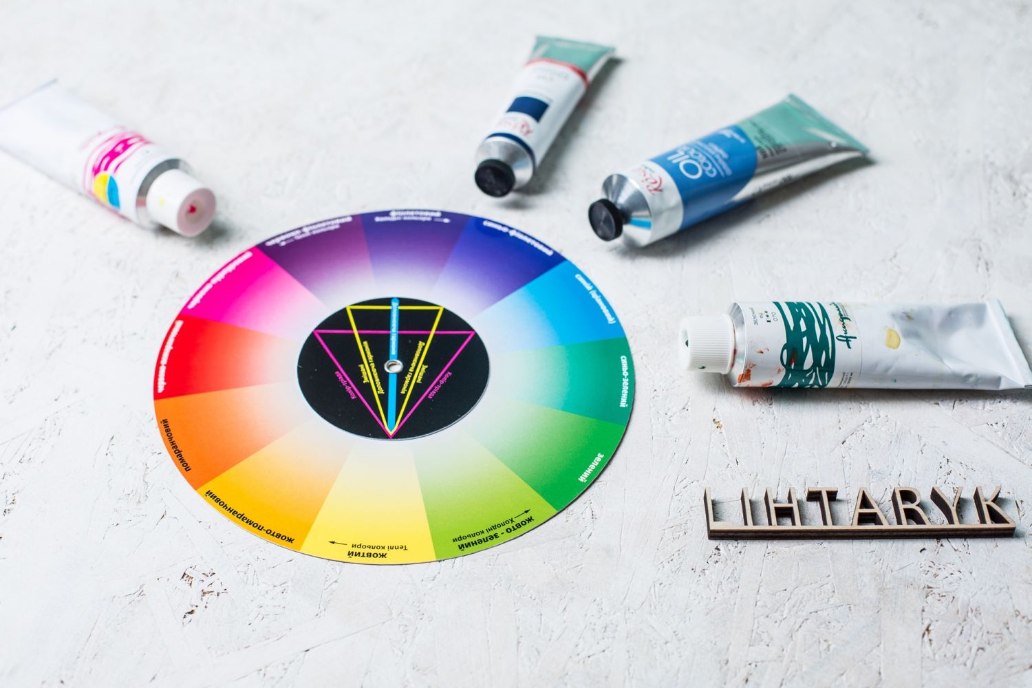
Basically we distinguish three colours which are impossible to obtain by mixing: red, blue and yellow. Such colours are called the basic ones.
Secondary colours are obtained by mixing the primary ones: yellow and red produce orange, yellow and blue produce green, red and blue produce violet. Tertiary colours are obtained by combining primary and secondary colours.
In this way it becomes obvious that the colour wheel is indispensable for budding artists when it comes to mixing colours on a palette. However, a colour wheel also gives an opportunity to combine colours in one’s wardrobe, work with contrasts and create harmonious colour combinations in the interior.
There are several variants of harmonious combination of colours:
Knowing these rules it is possible to create a colour scheme of the future picture. So in order to find your way around colours better, please come to our master-classes in oil painting or fluid art at the Lihtaryk Art Studio and try to discover your favourite combinations together with an experienced artist.
Побывали с подругой на мастер – классе по гончарству. Очень понравился и сам процесс творчества , и мастер и очень душевная атмосфера. Безумно чудесный и увлекательный мастер – класс!! Рекомендую всем , кто хочет узнать новые виды творчества, развивать фантазию и просто отдохнуть душой ;)) Огромное спасибо мастеру и Коллективу Арт студии Лихтарик. Есть желание теперь попробовать и другие мастер – классы студии.
Алена
Были с молодым человеком на мастерклассе по гончарвству. Безумно понравилось! Мастер Соломия очень приятная и оставляет доброе впечатление на душе! Хочется вернуться снова
Алина
Була з двома дітьми 7 років на гончарстві.
Що можу сказати? Соломія- це душа глини, з якої ми ліпили вироби. Затишна, дружня, цікава атмосфера. Як хтось вже писав, людей тут люблять. Згодна на 100%. За відведений час планувалося зробити два вироби. Один, ліплення руками, другий на гончарному колі. Діти встигли по 3. І ніхто їх фантазію не зупинив, про ціну глини та її витрати не говорив. За що окрема подяка Соломії та адміністратору. Залишили вироби для обжигу. Через 3 тижні зможемо їсти з тарілочок, що діти самі ліпити. Це фантастика!
Нам так сподобалося, що хочемо ще повернутися на ебру та розпис сумки і футболки
Ще вразило, що там багато відвідувачів дорослих. Саме не дітей, а дорослих, які творчо розвиваються.
Людмила
Відвідали майстер-клас по Петрикіському розпису. Дужжжже сподобалося. Чудові емоції та багато позитиву. Окрема подяка нашому керівнику Олені, яка проводила МК, зрозуміло все пояснювала, підсказувала, і виправляла наші недоліки. Неодмінно прийдемо ще раз.
Ольга
Була на майстер-класі з гончарного мистецтва. Проводила індивідуальне заняття майстер Ольга. Це просто якесь диво, як з шматочка глини з’являється витвір, зроблений власними руками і фантазією. Допомога майстра була коректною, інтелегентною, ненав’язливою. Прекрасний майстер-клас, прекрасні відчуття, фантастичний настрій. Дякую майстрині за щирість і терпіння. Ви робите справжє диво!
Людмила
Очень приятно и терапевтично провела время на групповом занятии по масляной живописи. Ведущая Даша подсказывала, помогала и поддерживала, так как для меня это первый опыт взаимодействия с масляными красками. Хочу еще к вам попасть на эбру и мозаику. Благодарю за незабываемые впечатления!
Наталья
Хочу подякувати за індивідуальний майстер-клас з живопису, була ще на початку осені) Мені все дуже сподобалось, чудовий майстер Юля все розказувала/підказувала, картина вийшла прекрасною,я милуюся нею щодня!) Була у Ліхтарику вперше, але стало зрозуміло, що тут підлаштовуються під запрос клієнта, йдуть на зустріч, що не зустрінеш у більшості! Дякую!
Настя
Отличный способ держать мозг в тонусе – переключаться. Причем на что-то совершенно иное, чем ежедневные занятия.
Так, углубляясь во всякие образовательные штуки по работе, в какой-то момент начала ощущать, что все. Мои полномочия окончены.
И в этот момент очень удачно в моей жизни появилось, наверное, мое самое любимое увлечение – творчество. Собственно, этот постик я и хочу посвятить рассказу о совершенно чудесной арт-студии, которая делает счастливыми много людей – мой любимый Ліхтарик.
Это место для самых разных аудиторий: как для детей, которым родители хотят привить чувство прекрасного, так и для семей, которые ищут интересный досуг на выходных. Для очень многих!
Чем, собственно, можно заняться в “Ліхтарике”?
Первое. Творить руками. Кто бы мог подумать, что всего за 3-4 часа ты, без особой подготовки, можешь нарисовать целую картину (точнее срисовать)! Повесить ее на кухне и постоянно удивлять гостей, например. Или подарить близким, что тоже приятно. Так вот, в “Ліхтарике” можно рисовать. Чем угодно – акварелью, маслом, карандашем или даже кофе!
Кроме рисунка, здесь можно лепить разные поделки из глины. Мы, например, здесь сделали чашку и тарелку. Из этой чашки я с особым удвольствием пью кофе.
Или же можно попробовать себя в чем-то совсем нетипичном. Например, в книжной иллюстарции.
Второе. Познавать новое. И для меня это отдельный кайф. Уже которую неделю подряд я хожу на лекции по истории искусства и это настоящая находка! Лектор подает информацию в такой понятной и, часто, веселой форме, что ты просто не можешь не запоминать ее. А потом идешь, и смотришь сериал “Борджиа”, изучаешь институт папства в Риме или историю Лувра, потому что «для маркетологов там целый кладезь инсайтов» ? Круто же!
В общем, вся эта лирика – выражение благодарности ребятам за то, что они делают. Это кайф.
Alina Reshetnyak
Лекции по истории искусства ? Очень содержательно и легко запоминается информация, несмотря на объемное содержание.
Помимо основного, после каждой лекции на почту отправляются доп материалы.
Мега-интересно и полезно ? спасибо ?
Anna
Превосходное место для даровитых творческих личностей, чтобы раскрыть и преумножить свой талант. Ненавязчивая, лёгкая, приятная атмосфера органично смешивается с впечатлениями от мастер-классов, а приветливый персонал и глоток ароматного чая во время работы над картиной никого не оставит равнодушным. Занимательным и достойным времяпрепровождением также можно считать и лекции, проводящиеся в этом чудесном месте уже не первый год. Лектор Светлана покажет и расскажет слушателям о трудной, тернистой дороге искусства, об её истоках и отражениях в современных реалиях. Прекрасное место для душевного отдыха и перезагрузки.
Cookie Taff
Надзвичайно приємна атмосфера, ввічливі майстрині та художниці надали змогу опанувати техніку Петриківського розпису. Це було цікаво і захоплююче. Радитиму усим відвідувати такі майстер-класи для себе, для розширення кругозору та втілити мрію стати художником чи скульптором. Це надихає!
Артем
Вчора була на майстеркласі “Кавовий живопис”. Дуже тепло зустріли, Впорядкували парасольку, Всі ввічливі, щирі і доброзичливі. Півтори години заняття минули швидко і в приємній атмосфері. Я ні крапельки не пошкодувала, що приїхала сюди аж за сто кілометрів. Неймовірний релакс! А дорога додому була в спокійних і приємних роздумах. З”явилась віра в свої сили і вміння. Дякую вам, ліхтарчани!
Галина Бойко
Были на гончарстве – ОЧЕНЬ понравилось! Атмосфера превосходная, помочь всегда готовы, всему научат, все необходимые инструменты в полном распоряжении гостей. Оторвались от этого мира и полностью окунулись в искусство. Спасибо огромное!
Анна Гетман
Скорость ответа и решения вопроса мгновенная. Выполняют обещания.
Приятный коллектив в общении.
Атмосфера уютная и располагает к творческой работе.
Нам понравилось!
Таня Шовкопляс
Были в арт-студии Лихтарик в октябре 2019 всем классом. Дети изготавливали подставки под горячее из мозаики. Очень понравилось! Здорово!
Инна Туренок
Добрый день! Были на мастер-классе для взрослых по масляной живописи, все прошло просто супер. Атмосфера прекрасная, персонал приветливый, картина получилась на все 100. Спасибо Вам большое)))))
Юлія
Посетила мастер-класс по Fluid art. Очень понравилось, рекомендую!
Таня Миронюк
Облюбовали эту АРТ-студию за приветливый, красивый и молодой коллектив, за интересные и творческие занятия, отличная атмосфера- время пролетает незаметно. Мы были на Эбру, Жидкий акрил, Гончарство, Роспись писанок- всё вызывало восторг и желание прийти снова. Девочки-умнички, спасибо Вам за чудесное настроение и желание творить, пробовать что-то новое. Удачи Вам.
Светлана Собченко
Уникальное место для нового опыта и чувств Крайне рекомендую тем, кто хотел выразить себя в искусстве но так и не смог
Андрей Роговский
Отпраздновали День Рождения поучавствовав в мастерклассе по гончарству! Все участники остались очень довольны. Супер понравилось! Этот День Рождения запомнится на всю жизнь! Благодарим организаторов!)))
Ольга
Очень понравилось. Релакс души через руки.
Сергей Маленко
Были с дочкой 10лет на 《Гончарстве》-это прекрасно. Ожидания оправданы. Есть этап самостоятельной лепки за столом, где во всем готовы помочь и не большое время для каждого за гончарным кругом. Получается даже у детей вазочки, тарелочки, горшочки.
Together!
Были на мастер-классе по фешнскетчингу. Очень понравилось)
Ольга Якимова
Відвідала майстер-клас з гончарства. Мені надзвичайно пощастило бути одній на груповому занятті, тому воно перетворилося на індивідуальне і стало просто чудовим! Була можливість вдосталь повзаємодіяти із матеріалом, насолодитися роботою на гончарному колі. Викладачка дуже приємна та уважна. Дуже влучно скеровувала процес та допомагала вміру необхідності. Ввела в курс справи щодо особливостей глини як формотворчого матеріалу, його можливості та різні види обробки. Вцілому залишилися найпозитивніші враження від атмосфери, творчість захопила, час пролетів непомітно. Дякую майстру та студії за таку можливість. Всім раджу спробувати!
Тетяна Шендебура
Відвідала 21 вересня майстер – клас з кавового живопису. Я в захваті!!! Не тільки сама намалювала картину, отримала корисні поради, але й відчула справжніє задоволення від творчості у затішній, зручній, дружній та ароматній майстерні!!! Дякую за чудову ароматерапію :)))) Раджу всім!!! Кава особливо ароматна восени :)))
Олена
24.07.2019 відвідали з дитиною майстер-клас з мозаїки. Дякуємо викладачеві за допомогу, уважність і терпіння!) Весь вечір творчості проходив у комфортній домашній обстановці.
Дитина була безмежно щаслива, йшла додому танцюючи і обдумуючи яку саме фотографію поставити в новеньку рамку, яку зробила своїми руками. Ще раз дякуємо за позитивні емоції!)
Добрый! Была на мастер-классе живописи масляными красками. Супер! Море позитива, получила удовольствие, даже больше, чем ожидала. Проводила мастер класс Анна. Анечка, спасибо огромное за то, что делитесь своими умениями и знаниями, за терпение и помощь. Рекомендую всем, даже тем, кто никогда не держал кисти в руках.
Наталия
Очень понравилась услуга, потрясающая девушка преподаватель: все помогала, подсказывала, исправляла наши ошибки по просьбе)))!! Досточка получилась очень красивая!)) Студия очень понравилась, обязательно буду ходить на и на другие направления!) рекомендую!!!
Даша
Очень понравилось. Ходили всей семьёй. Но это для тех, кто любит рисовать. Или когда то любил. Вдохновляет и расслабляет. Досточки с рисунками отдают с собой. Позитивно)))
Ирина
Занятие очень понравилось. Нам прекрасно преподнесли азы петроковской росписи
Ольга
Осталась в восторге от Мастер класса по мозаике. Очень приятный учитель – Алексей, который уделял внимание каждому ученику, рассказывал о деталях и выполнении техники мозаики. Все материалы были в наличии в классе. Отличный вечер вдохновения и творчества!
Алёна
Дякуємо за чудовий майстер клас! діти у захваті. Дуже сподобалась сама студія та майстри. Затишна творча атмосфера. Робили красиві масивні фоторамки з мозаїки. Плануємо відвідати і інші майстер класи. Зацікавив майстерклас “Живопис кавою”
Legatto
Это совершенно новые эмоции и неповторимый опыт) Обязательно посетите индивидуальный урок гончарства! Интересно, местами сложно, но очень увлекательно) и небольшой бонус-можно забрать изделие, которое получилось) пригодится в быту или останется прекрасным сувениром и напоминаем о классном времяпровождении!
Natali Vladimirovna
Провели тут новорічний корпоратив. Це було дуууже круто! Творча та приемна атмосфера, зручне розташування і приемні співробітники. Плануемо повернутися на гончарство.
Намалювали круті футболки ))
Наталия Велкова
Недавно решили с мужем как-то интересно провести выходной и остановились на мастер-классе для двоих по рисованию маслом. Много студий рисования я обзвонила, так как запрос был не простой: я хотела рисовать в ботаническом саду вместе с художником. Большинство людей предлагало мне эту услугу по цене от которой рисовать уже не хотелось)) Меня приятно удивило, что в «Ліхтарик» цена была очень вменяема + меня сразу проконсультировала приятная девушка Светлана, и наш вопрос решился на протяжении 10 минут. Но ближе к дате сильно похолодало и мы решили рисовать в студии, что было правильным решением, как потом оказалось, потому что масло не так просто отмыть от рук, а на природе вообще не представляю как это сделать) Индивидуальный подход к каждому гостю это когда ты хочешь нарисовать картину размером 120*70см за 2 часа втроем с художником (а стандартные МК картины гораздо меньше) и для тебя делают все чтобы это было в лучшем виде! С художником было приятно работать, в общем удовольствия куча. А теперь главное: а главное то, что когда мы дорисовали и уже все оплатили. Я картину сфотографировала. Через пару дней посмотрела на фотографию и поняла что в интерьере у нас немного другие цвета. Поэтому позвонила и попросилась приехать и дорисовать. И мне сразу дали зеленый свет! Я не ожидала. И с меня за эти мои «дорисовки» оплаты не взяли, хоть краски я использовала нормально. В общем тут любят людей!) И я не могла оставить свой поход без отзыва, спасибо вам, Ліхтарик, за красивенную картину которая уже точно впишется в интерьер!
Оксана
Очень приятное место , отдельное спасибо Марине , очень приятная девочка . Все получилось . Кое кто написал что мало места . Вы идете танцевать и прыгать или руками работать ?! Для того что бы сделать из глины тарелку или воплотить свою фантазию места даже много . Огромное спасибо вам за эмоции , мы ещё вернёмся )
Олексій Журавльов
ГОНЧАРСТВО!
Атмосфера чудестная. Здорово когда в комнате сидят 6ти летние дети и взрослые люди. У нас был педагог Марина которая легко распределяла внимание на 7 человек, разговаривая на украинском и русском языках?
А ещё есть индивидуальные занятия на которых вам уделят максимум времени и вы сможете слепить хоть 4 предмета!
Поліна Кунцевич
Дуже гарний, чудовий і уважний викладач, сподобалось, що будь-яку помилку можна виправити просто додавши води або почавши все знову – всім рекомендую!)
Андрій Овдійко
Нарешті дісталася компа і можу написати, наскільки вдячна вам я)).. Все відбулося саме так, як я хотіла – ніхто спеціально дітей не розважав, не “направляв потоки”, хоча було їх близько 20-ти, не опікав і ні до чого не примушував.. вся атмосфера спонукала всіх до того, аби взяти в руки глину і самому вирішити – що саме робити, в якому порядку.. Мені дуже сподобалося те, як поводилися майстрині з дітьми – ніякої надопіки, сюсюкання – все по-дорослому, по справі, дуже позитивно, тільки з необхідним втручанням, по потребі.. Всі були максимально в процесі і круто провели час.. Як на мене, це – ідеальний формат як для ДН, так і для таких “тимбілдінгових” заходів в класах, компаніями.. Тож, певна, ви нас ще в себе побачите не раз великою бандою)).. Дуже дякую за круту здорову атмосферу та гостинність)
Юліана Литвиненко
Відвідали сьогодні МК з гончарної майстерності. Дякую за чудово проведені 90 хвилин! Приємна атмосфера і якісна допомога)) До Вас хочеться повертатись
Наталія Срібна
Вперше була на уроці гончарства.Дуже вражена атмосферою,вчителем(якщо так правильно буде сказати) Улляною,яка приділа кожному учневі максимум уваги.Все вдавалось,хоч досвіду зовсім не було до цього.
Хочу сказати дякую арт студії,за можливість надихАтися,творити і отримувати щирі емоціі щастя!
Татьяна Андреева
Не в первый раз снова была в Ліхтарике. Для меня это место релакса, освобождения от мыслей, тактильное удовлетворение и творчество. Рекомендую всем!?
Ольга Евчина
2августа 2018 посетила мастер класс по петриковской росписи Очень и очень довольна внимательностью и любовью мастера Дашей Ее умением и талантом делать нам прекрасное настроение Большое Всем спасибо
Лидия
Чудова атмосфера, привітні адміністратор та вчителі. Переповнює радість від виготовлених з глини робіт!!!
Рекомендую всім.
Olena Fruit
Відпочили душею та розумом )Не треба вагатись-варто спробувати…перезавантаження вдалось !)Особливо вдячні Поліні!)
Ivanna Gordinskaia
У меня синдром Стендаля сегодня. Утром ходили в Падуанский баптистерий. Смотрели фрески Менабуя. А после обеда у нас было посещение каппелы Скровеньи. Теперь я понимаю , что сделал Джотто для мира. Очень меня все это впечатлило в живую. Привет передала.![]()
![]() Мир прекрасен. Падуя очень понравилась:) спасибо за лекции Света!
Мир прекрасен. Падуя очень понравилась:) спасибо за лекции Света!
Lily Golovchak
Дякуємо за чудовий майстер клас! діти у захваті. Дуже сподобалась сама студія та майстри. Затишна творча атмосфера. Робили красиві масивні фоторамки з мозаїки. Плануємо відвідати і інші майстер класи. Зацікавив майстерклас “Живопис кавою”
Legatto
Были на мастер-классе 10 февраля. ну оооооочень понравилось. Сделать что-то интересное своими руками – разве это не прекрасно? В абсолютно свободной уютной и творческой атмосфере хочется побывать еще и еще. Жаль, мы из другого города, не можем часто позволить себе бывать на мастер-классах. Но если бы могли, мы бы, без сомнений, приходили бы практически каждую неделю. От всего сердца рекомендую пережить это каждому. Спасибо!
Павел
Сьогодні відідав майстер-клас по гончарству. Спочатку був настроєний скептично, проте з перших хвилин зрозумів, що мені сподобається. Все було дуже круто! Окрема подяка нашому майстру Уляні, сонячна дівчина, яка любить свою справу.Ніхто не був обділений увагою, і кожен спробував свої сили на гончарному колі та в ліпленні вручну. З першого разу вийшло не дуже майстерно, проте повернусь сюди ще і буду рекомендувати вас друзям! Ви зробили мій день, дякую!
romvladed _
Прийшли з подругою на МК з гончарства. Особисто я була трохи здивована, що все розміщено у звичайній квартирі. Ми зайняли останню кімнату, а в сусідній тим часом люд малював картини. На диво, ця певна тіснота (умовна) досить приємна і атмосферна. Загалом дуже затишно та невимушено.
Дуже дякую Уляні – майстерна робота на МК одразу з усіма 10-ма бажаючими (різновікова аудиторія від найменших діточок до старших дівчат та хлопців). Це до того ж, що ліпили і фігурки і працювали з Гончарний колом!
І що дуже приємно – напрочуд тепло у приміщенні.
Виріб можна забрати, а за окрему плату випалити посуд (щоб ним можна було користуватися в побуті).
Раджу усім, кому це цікаво – не пошкодуєте!
Svetlana Cherniak
Мені дуже подобається Ліхтарик. Вперше потрапила на майстер клас по запрошенню подруги у 2013, малювала пастеллю. Це була моя перша картина і я не могла висидіти 3 години, але дуже хотілося все ж побачити це чудо. І так почався мій творчий успіх – далі доля мене зводить з Ліхтариком і на корпоративні арт вечірки і подарунки майстер-класи на день народження, і глиняний мк відвідувала, і просто коли творча хвиля прилітає) Зручно те, що за раз можна намалювати і побачити результат своєі роботи. Завжди дружня та відкрита команда Ліхтарика допомагає навести штрихи і – вуаля! Зробити майстер-клас комфортним та атмосферним. По ціні – більше ніж доступно. Люблю Ліхтарик і за те, що прилетіла муза- зателефонувала, дізналась коли можна прийти і все чудово. Зручно і легко. Нещодавно ми організували мк моій мамі на День народження. Ми малювали вдвох) обрали 2 різні картини, що сподобались. Це був неймовірний сюрприз і щастя, адже мама вже дуже давно не малювала) і взагалі на це ніколи не вистачає часу. Рекомендую всім, спробуйте. І ви дізнаєтесь, що у всіх нас живе творчість. Дякую, Ліхтарик
Ірина Пастухова
був дуже цікавий майстер-клас з гончарства. Все було професійно організовано, почалось вчасно, майстер була дуже приязна і все детально пояснювала. Заберемо свої вироби за місяць
Evhenia Nakonechna
Дякуємо студії “Ліхтарик” та чудовій майстрині Уляні за чарівний ранок. Ходили з подругою на майстер-клас для двох з виготовлення посуду на гончарному колі. Тривалість заняття – дві години, за цей час кожна з нас мала можливість зробити дві речі на свій вибір. Пані Уляна дуже гарно пояснювала та показувала; допомагала скоригувати помилки, зроблені нашими невмілими руками. Результат – наші вироби вийшли навіть нічогенькими (та що я там прибідняюся – дякуючи пані Уляні, наш посуд є саме таким, як треба)
Larysa Macewicz
Доброго дня. Напередодні зв’язалася з вами по телефону, оплатила гроші на карту і дуже оперативно отримала сертифікат на свою пошту. Відвідали парою в суботу (25.11) груповий майстер-клас з гончарства. Надзвичайно сподобалося!
Дуже ввічлива, талановита, уважна і приємна майстер Ульяна. Отримали таку насолоду і задоволення протягом 2 годин. Однозначно рекомендуватиму Вас всім друзям. Дякую Вам! Всього найкращого.
Ірина
Очень понравился мастер-класс по рисованию кофе) Ароматы кофе, корицы, какао создают невероятную атмосферу) И сама студия, ее руководители, мастера – настолько приятные люди, что там чувствуешь себя, как у друга в гостях)) Всем советую побывать в этом прекрасном месте, вы не пожалеете)) И Спасибо большое арт-студии за впечатление!!))
Катруня Кононеко
Були в Ліхтарику на мій день народження разом із чоловіком. Повністю занурились у творчий процес. Не зважаючи на те, що ми запізнились, нам провели повний урок, все пояснили та допомагали. Ми змогли виліпити і вручну певні фігурки, і на гончарному крузі чашечку та вазочку. Наша порада – це одягати звичайний одяг, який не шкода заляпати, бо ми в процесі забули про все, хоч нам і видали довгі фартухи. Хоча глина дуже легко знімається із тканин. Одним словом, ми дуже вдячні. І не маємо жодних зауважень))
Anastasia Namaste
В неділю була на майстер-класі з петриківського розпису. Сподобалося все: тепла ніби домашня обстановка, щира доброзичлива вчителька і розмальована власними руками стільничка. Завдяки Даші за короткий час мені, людині, яка пензлика в руках не вміє тримати, все вдалося. Тепер зможу самостійно розмальовувати дерев’яні сувеніри. Дуже дякую всім, хто брав участь в майстер-класі і його організації за те, що творите і поширюєте прекрасне
Одарка Герило
Дитина 6 років ходить на групові уроки гончарства до Ульяни. Я дуже прискіплива, але нам все сподобалось. Вчитель від природи дуже делікатна, тактовна людина. Цінує творчість і підтримує іі в дітині. З дітьми ладнає добре. Уваги всім приділяє на занятті.
Inen Zhuk
A place where soul rests
If you happen to be or live in Kyiv and are looking for a place to switch off your worries and switch on your creativity – this is it! Likhtaryk (Lampade-Arte) is definitely a place to come back to again and again whether you are alone, with your partner, kids or a bunch of friends – the lovely and highly professional personnel will always warmly welcome you, create a cosy atmosphere of true art and passion. English speakers too. The types of masterclasses varies widely and will satisfy the most demanding participants. They know a special way to kids’ hearts and none will leave unsatisfied! Definitely recommended!
Tanya Lesyk
Atmosphere of kindness,joy and art!
I really relish this artstudio because there I can do both things-relax from an intense rhythm of a working week and broaden my horizons,knowing a lot about the world culture.Furthemore I enjoy classes of painting in oils,everyone at the end of the class gets a gorgeous picture and you really don`t notice the time that you spend on doing it.So I really advice this place to everyone who would like to visit a piece of Europe in Kyiv,touch the world of art and create your own masterpiece!
Katherine Nosko
Likhtaryk forever
This is a wonderful place where you can spend time both themselves and your family to develop your talent in a friendly atmosphere.
Людмила Овсиенко
Your Own Masterpiece
Do you admire the paintings on Andriyivskyy Descent? It’s time to create your own masterpiece.
In my opinion, the attitude is what differentiates the Likhtaryk among the other art studios.
Atmosphere at the studio is relaxing and friendly, so you may relax, enjoy and be yourself, regardless of the age, status and skills.
If you need advice, the teacher will come to you and help. Moreover, you may finish your work another day if you wish.
I’ve already visited the Likhtaryk studio several times. Here I have a chance to try different art techniques and styles.
JAll the necessary materials are provided by the studio. Caring staff will make all the arrangements before you start creating a piece of art, and also no need to clean your workplace afterwards 🙂
Also I was pleased with reasonable prices and central location of the studio.
Yevgeniya K.
Nice place to visit while you are in Kiev
I was surprised to discover such an interesting place in the center of Kiev. I was looking for something new, creative and not trivial place.
Likhtaryk Art Studio provides a cozy, warm and welcoming atmosphere, their friendly staff treated us their delicious tea with candies and told us about their activities.
In a result we decided to have an oil painting masterclass. I can say that whether you’re improving your technique or starting from scratch, this class will help you to paint with confidence.
After 3 hours we drew a nice picture that will remind me about this pleasant time.
Nataly Skopich
Amazing experience
I did the History of Arts course here last year and can recommend this studio to everyone visiting Kiev. They offer a wide variety of activities to match your cultural interests:) You will enjoy pleasant atmosphere and Ukrainian authenticity here:)
Elena Kapitanenko
"Everything you need and more"
This place is awesome. Great service and soooooooo friendly. Polite, funny, knowledgeable and really helpful staff. Very competitive prices. If you’re looking to learn something new, I would suggest you schedule a lesson.
Ol1s
Great time to have a rest
I have visited Art Studio Likhtaryk more than 5 times. And every visit it was a time of joy and relax. Painting in different techniques and pottering are the way to find something new in yourself. With the help of professional trainers you enjoy both the process and result.
Viktoria Rudenko
Сlass on pottery
I had a class in pottery. And I must say had a great time with interesting people, attentive teacher and delicious tea. It’s like a house of your friends, I would recommend Likhtaryk Art Studio to all ages and interests!
Tanya Vueva
Pleasant experience
I had a great time visiting this Art Studio. The time passed very quickly. I made a beautiful pot and a nice cup. It was very unusual and interesting. Good location – it is situated in the center part of Kyiv, near the Botanical gargen, high-quality servise, reasonable price and vivid impression.
Alexey Z
Очень уютная студия, позитивные и интересные ведущие мастер-классов.
Анастасия Васильева
Дякую, за приємний майстер-клас з гончарної майстерності. Незабутня атмосфера арт-студії, привітні менеджери та майстри, і процес роботи з глиною за гончарним колом залишили море позитивних емоцій. Вже придивляюся до інших майстер-класів,які можна відвідати )))
Инна Лубенец
Приветливая, располагающая и творческая атмосфера ???? Всегда творила с большим удовольствием у вас
Ольга Бубряк
був дуже цікавий майстер-клас з гончарства. Все було професійно організовано, почалось вчасно, майстер була дуже приязна і все детально пояснювала. Заберемо свої вироби за місяць
Evhenia Nakonechna
Посетилаа мастер-класс по живописи, который курировала Елена. Это была моя первая работа, и я осталась очень довольна студией, комфортом, сервисом и наставничеством. За три часа получилась прекрасная готовая картина, при этом вся работа была сделана лично мной, Елена только объясняла и давала советы. Очень понравилось, приду к вам еще!
Евгения Лисовенко
Була на майстер-класі з гончарства. Отримала мега задоволення. Хочеться ще більше творити 🙂
Polina Fedorenko
Очень интересно и познавательно. Творческая атмосфера. Однозначно прийду ещё. Ребята большие молодцы.
Денис Яковенко
Приятная атмосфера и понятные пояснения – хорошие условия для творчества. Мастер-классы по живописи, гончарству и многое другое оставляют вам на память не только приятные воспоминания, но и какое-нибудь изделие, созданное своими руками под чутким руководством мастера.
Любовь Вишневая
Дочка була на майстер-класі з малювання аквареллю. Її навчили основи та підказали що далі робити. Дуже задоволена.
Олександр С.
30.10 ми відвідали майстер-клас з гончарного мистецтва в студії “Ліхтарик”. В арт-студії досить комфортна обстановка, і сам процес- налаштовує на відпочинок і релакс.
Ми виготовили фігурки з глини та глечик і тарілочку на гончарному кругу. В усьому нам допомагав порадами і діями Богдан, за що йому окреме спасибі!
Таке заняття буде цікаве як і діткам, так і молодим людям, як ми (22-23р).
Нам все сподобалось! Студії бажаємо процвітання!
Радимо:)
Foto Mafiya
Неймовірно сподобалось гончарство. Приємні вчителі та заспокійлива атмосфера дає тобі повністю поринути в процес. Раджу всім, дуже заспокоює)
Юра Дмитренко
Спасибо огромное за чудесный мастер-класс по гончарному мастерству! Сегодня посетили его с подружкой и остались в восторге! Ульяна – девочка, которая проводила мастер-класс, – просто волшебница!!! То, как она преображала одну форму глиняного изделия в другую, с какой лёгкостью и с какой любовью к своему делу она творила свои изделия, – нас просто завораживало… Спасибо ей огромное за мастер-класс, за ее помощь и терпение в создании наших творений и за те положительные эмоции, которые мы получили на этом МК! Успехов Вам и процветания!!!! До новых встреч!
Александра Катюшина
Были с подружкой на мастер-классе по гончарному искусству. Все очень понравилось, уютненькая студия, вежливый персонал. Спасибо за хорошо проведенное время.
Инна Лубенец
Отличный мастер-класс по гончарному мастерству провели в этой уютной арт-студии. Спасибо Ане за мастер-класс и Алексею за радушный приём.
Юрий
Записались на индивидуальный гончарный мастер-класс : 2 девочки 9 и 10 лет – дети в восторге! Дети долго потом нам рассказывали о своих впечатлениях. Создали 2 изделия: свистульку и подсвечник/вазу. Спасибо огромное студии за продуктивное занятие! Всем довольны и будем рекомендовать мастер-класс знакомым!
Дарья Киценко
Были на мастер классе по гончарному мастерству 13 января. Очень понравилось. Было ощущение какого-то волшебства – из куска глины создать блюдо или горшочек. Спасибо большое вам!!!
Александра Тарченко
Занятия по гончарству для деток просто восторг, после каждого занятия на память остаются изделия сделанные своими руками и невероятные ощущение тепла, душевности от творчества с глиной, обучают прекрасные мастера. Рекомендую!
Виктория Морфлюк-Щур
Our location


